Plotting Data
Functions: plot(), labels, and arguments pch, col, cex.
Learning Goals
A. Foundational Knowledge
- Learn to make simple plots of numeric and factorial data
- Modify these simple plots
B. Application
- Make plots according to publisher or thesis requirements
C. Integration & Human Dimension
- Begin to understand how people see and understand data as images
Make a simple graph
Let's use the small bird data from the first class, creating a data frame, and adding a column for species.
BirdData <- data.frame(
            Tarsus  = c(22.3, 19.7, 20.8, 20.3, 20.8, 21.5, 20.6, 21.5),
            Head    = c(31.2, 30.4, 30.6, 30.3, 30.3, 30.8, 32.5, 31.6),
            Weight  = c(9.5, 13.8, 14.8, 15.2, 15.5, 15.6, 15.6, 15.7),
            Wingcrd = c(59, 55, 53.5, 55, 52.5, 57.5, 53, 55),
            Species = c('A', 'A', 'A', 'A', 'A',  'B', 'B', 'B')
            )
Check it
BirdData## Tarsus Head Weight Wingcrd Species
## 1 22.3 31.2 9.5 59.0 A
## 2 19.7 30.4 13.8 55.0 A
## 3 20.8 30.6 14.8 53.5 A
## 4 20.3 30.3 15.2 55.0 A
## 5 20.8 30.3 15.5 52.5 A
## 6 21.5 30.8 15.6 57.5 B
## 7 20.6 32.5 15.6 53.0 B
## 8 21.5 31.6 15.7 55.0 BWe will start by using the plot() function, which does various things depending what data you input.
Plotting single columns (numeric or factors)
You can plot a single vector/column, and it will appear in the same order as the data.
plot(BirdData$Head)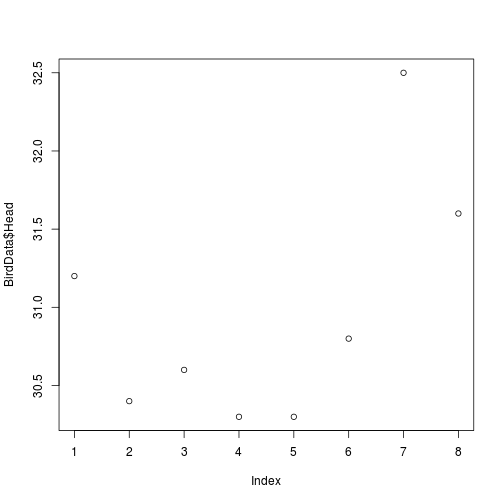
To arrange the data in ascending order, use sort()
plot(sort(BirdData$Head))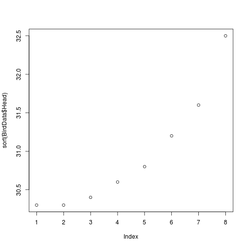
Plotting a factor results in counts of each level
plot(sort(BirdData$Species))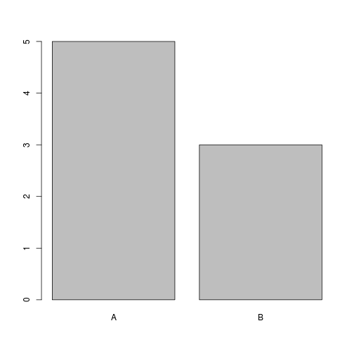
Plotting two columns (numeric or factors)
Two numeric columns makes a scatter plot
plot(BirdData$Head ~ BirdData$Tarsus)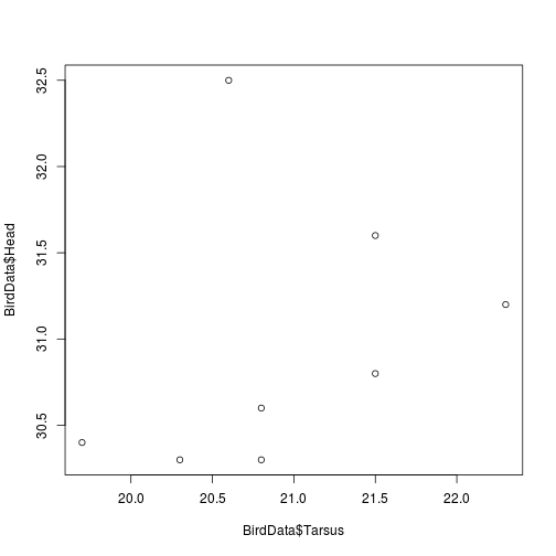
A numeric and a factor makes a boxplot
plot(BirdData$Head ~ BirdData$Species)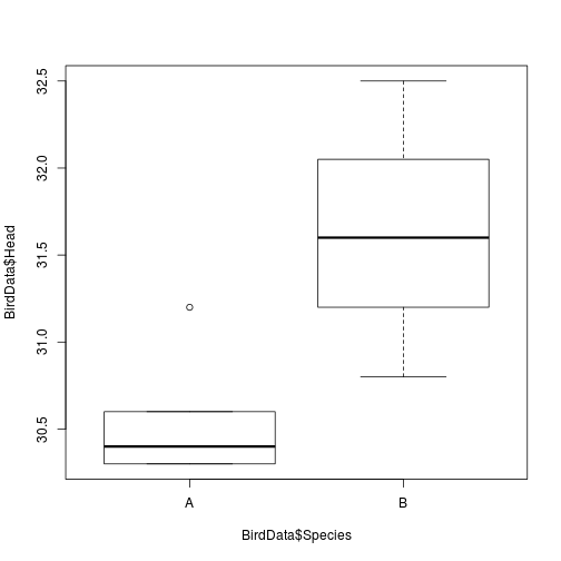
Two ways to call plot() data
The only two required arguments to use in plot() are x and y: the data arguments.
These two arguments can be specified explicitly.
plot(x = BirdData$Species, y = BirdData$Head)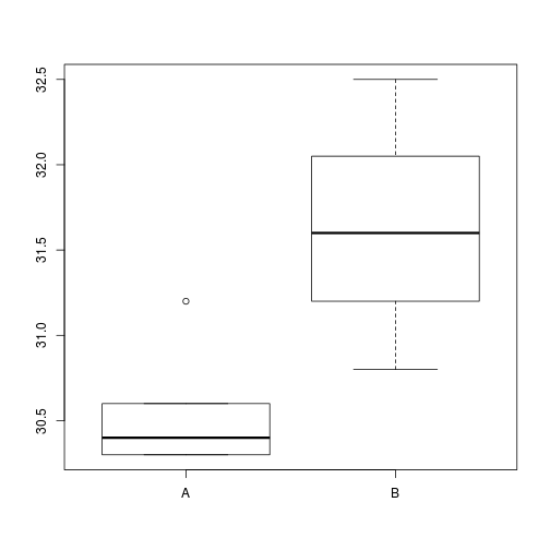
Or as a formula, as we did at first. If we do it this way, then R will also add axis labels.
plot(BirdData$Head ~ BirdData$Species)
We can also add in the data = argument, which makes things look a bit prettier.
plot(Head ~ Species, data = BirdData)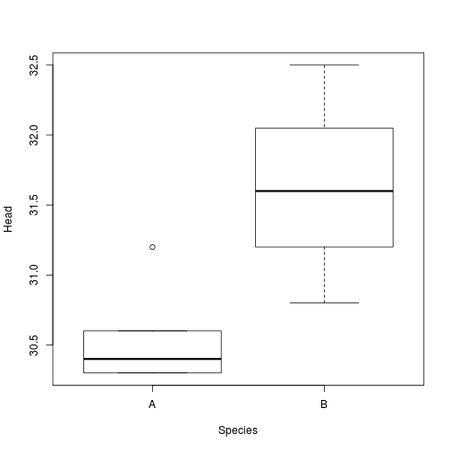
This also makes it a bit easier to sort the data if we want.
plot(Head ~ Tarsus, data = BirdData[order(BirdData$Tarsus), ])Modifying the plot
The default plot in R is not too bad (better than Excel, at least!), but does require some modification for publication.
Given that the default plot() only has two arguments, all subsequent arguments must be specified explicitly.
The kind of plot
The default is points, as above.
But we can make plots with only lines ...
plot(Head ~ Tarsus, data = BirdData[order(BirdData$Tarsus), ],
     type = 'l')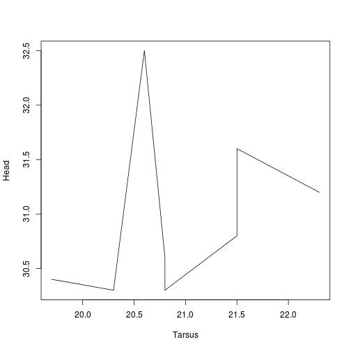
... or lines and points.
plot(Head ~ Tarsus, data = BirdData[order(BirdData$Tarsus), ],
     type = 'b')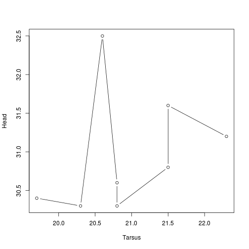
Labels: xlab, main
We can specify text for axis and main labels.
plot(Head ~ Species, data = BirdData,
     xlab = 'Species',                    # x axis label
     ylab = 'Head Size (mm)',             # y axis label
     main = 'A boxplot of sparrow data')  # text in bold at top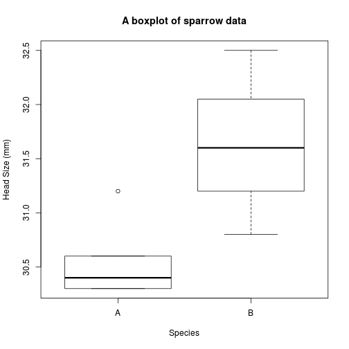
Symbols: pch
We can choose from a variety of different symbols, or plotting characters, using e.g., pch = 1.
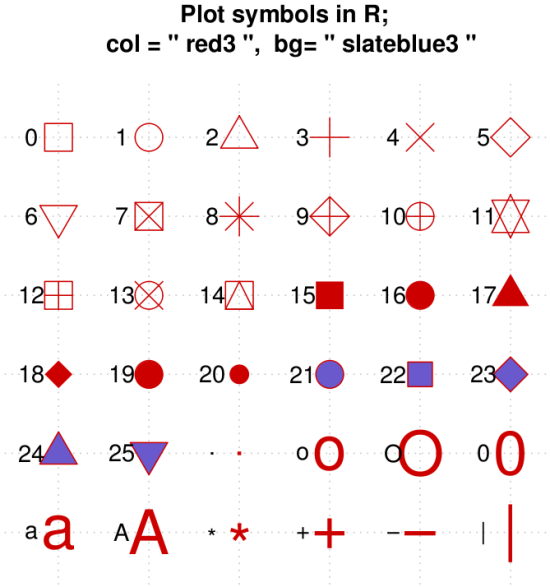
Fig. The range of characters in R. Source.
Colours: col
For publication in print, most often you will use shades of grey, but R has access to a wide range of colours.
Color for the data points or lines can be accessed via:
- number (e.g.,
col = 2), - name (e.g.,
col = 'red'), - hexadecimal (e.g.,
col = '#FF0000'), - or even RBG value.
plot(Head ~ Tarsus, data = BirdData,
     xlab = 'Tarsus (mm)',
     ylab = 'Head Size (mm)',
     main = 'A boxplot of sparrow data',
     pch = 20,                            # set symbol
     col = 'red')                         # set colour of points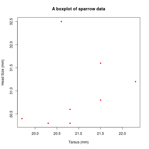
For a boxplot, col will fill in the boxes.
plot(Head ~ Species, data = BirdData,
     xlab = 'Species',
     ylab = 'Head Size (mm)',
     main = 'A boxplot of sparrow data',
     col = 'red')                         # set colour of points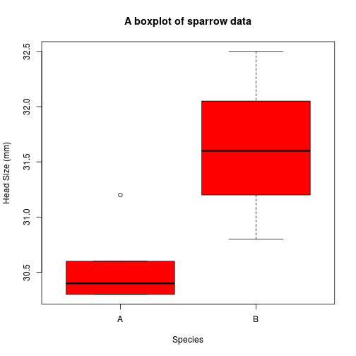
You can use col.lab =, col.main =, and col.axis = to change the colour of these external parts of the plot, if needed.
See here for more details than you want. (R code that generated the figures is here).
We will discuss colour in more detail next week.
Size: cex
The size of almost anything in a plot can be altered using cex =, a number giving the magnification relative to the default. The default changes depending on the layout of the plotting area, but starts as 1.
Size of data points is changed using cex =.
Size of text is changed using cex.lab = and cex.main =.
Size of the axes elements is changed using cex.axis =.
plot(Head ~ Tarsus, data = BirdData,
     xlab = 'Tarsus (mm)',
     ylab = 'Head Size (mm)',
     main = 'A boxplot of sparrow data',
     pch = 20,
     col = 'red',
cex = 3) # set symbol size to 3X 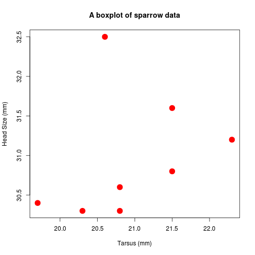
Modifying the plot with vectors
All the above can be changed using vectors, rather than addressing each individual element.
For example, we can make a vector of colours.
plot(Head ~ Tarsus, data = BirdData,
     xlab = 'Tarsus (mm)',
     ylab = 'Head Size (mm)',
     main = 'A boxplot of sparrow data',
     pch = 20,
     col = 1:8,        # here we have a vector the same length as the data
cex = 3) 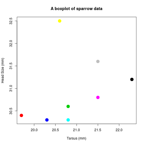
Or set colour according to species
plot(Head ~ Tarsus, data = BirdData,
     xlab = 'Tarsus (mm)',
     ylab = 'Head Size (mm)',
     main = 'A boxplot of sparrow data',
     pch = 20,
     col = Species,   # here we use a column name
cex = 3) 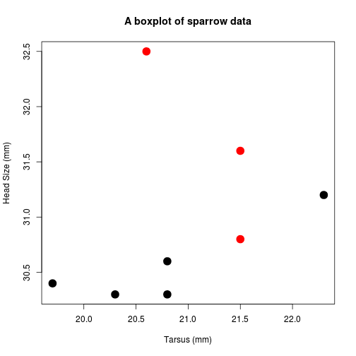
Exercises
Using the New Haven Road Race data...
dat <- read.table('http://www.simonqueenborough.info/R/data/race-data-full.txt', header = TRUE, sep  = '\t')
dat <- na.omit(dat)
dat2 <- droplevels(dat)- Make a plot of the number of runners in each age class.
The plot should include:
- axis labels in a larger font,
- Age classes >50 in red.
- Plot each runner's pace (y) as a function of their sex (x).
The plot should include:
- Proper axis labels,
- Axis numbers in a larger font,
- Males and females in different colours.
- Plot each runner's pace as a function of their age class.
The plot should include:
- Axis labels,
- Each box a different colour.
- Plot each runner's net time as a function of their pace.
The plot should have:
- Correct axis labels,
- Increasing symbol size with increasing pace,
Updated: 2016-09-27