Plotting More Data
Functions: par() and associated arguments, layout(), lines(), points(), text(), axes(), mtext(), box()
Packages: extrafonts, lattice, ggplot2
R code: r code
Learning Goals
A. Foundational Knowledge
- Modify default plots using the graphical parameters function
B. Application
- Make plots according to specific spublisher or thesis requirements
C. Integration & Human Dimension
- Understand the presentation of data
- Consider how best to present your data to tell its story
The default R graph
We continue with the small bird data...
BirdData <- data.frame(
            Tarsus  = c(22.3, 19.7, 20.8, 20.3, 20.8, 21.5, 20.6, 21.5),
            Head    = c(31.2, 30.4, 30.6, 30.3, 30.3, 30.8, 32.5, 31.6),
            Weight  = c(9.5, 13.8, 14.8, 15.2, 15.5, 15.6, 15.6, 15.7),
            Wingcrd = c(59, 55, 53.5, 55, 52.5, 57.5, 53, 55),
            Species = c('A', 'A', 'A', 'A', 'A',  'B', 'B', 'B')
            )
Check it
BirdData## Tarsus Head Weight Wingcrd Species
## 1 22.3 31.2 9.5 59.0 A
## 2 19.7 30.4 13.8 55.0 A
## 3 20.8 30.6 14.8 53.5 A
## 4 20.3 30.3 15.2 55.0 A
## 5 20.8 30.3 15.5 52.5 A
## 6 21.5 30.8 15.6 57.5 B
## 7 20.6 32.5 15.6 53.0 B
## 8 21.5 31.6 15.7 55.0 BHere is the last plot we made, with symbol colour a function of species.
plot(Head ~ Tarsus, data = BirdData,
     xlab = 'Tarsus (mm)',
     ylab = 'Head Size (mm)',
     main = 'A boxplot of sparrow data',
     pch = 20,
     col = Species,   # here we use a column name
cex = 3) 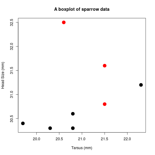
Further modifying the plot: par()
In the previous class, to modify elements of the graphic we added various arguments to the function plot().
However, if you look at the help file (?plot), there are only three arguments specified: plot(x, y, ...).
The argument ... is special and allows arguments for one function to be passed through another function. We will use this explicitly when we write our own functions, but for now, we can see that arguments such as cex, pch, etc. are not used directly by plot(). These arguments are actually arguments for the graphical parameters function par().
The parameters function, par(), is used to modify the basic appearance and layout of graphics.
There are a lot of parameters that you can control (see ?par). Some you will use all the time, others will not be touched.
They are all listed on the par() help page. You should spend some time looking over this page to see what other options are available.
All the arguments listed below are placed within par(), e.g., par(pch = 13, cex = 2).
Important! Once you use par() to change parameters, these settings will apply to all future graphics created in the open window
If you do not want this to happen, there are three ways to 'reset' par().
A. Close the open graphics window. Any new window will have the default parameters.
B. Nest plotting within two further lines of code. Here, the graphic parameter settings are stored in the variable op, we make our figures using the modified parameters, and par(op) resets the parameters to their defaults.
op <- par(mfrow = c(2, 2), mar = c(3, 3, 2, 1))
plot( ... )
plot( ... )
par(op)
C. Create all figures in their own specific graphic device function, as described later.
Axes
tick marks: tcl
You can flip the direction and set the length of axes tick marks.
Default: tcl = -0.5
To flip, remove the minus sign: par(tcl = 0.5). The ticks will now point inwards.
axis label and number distance: mgp
Sets the distance away from 0 of the axis title, axis labels and axis line.
Default: mgp = c(3, 1, 0)
If we have flipped the tick to point inwards, the axis numbers and title look better if they are moved slightly closer in: mgp = c(2.5, 0.5, 0).
suppress axis plotting: xaxt, yaxt
Setting xaxt = 'n' will suppress the plotting of the x axis, allowing you to create your own (see below).
Note that this will not suppress the axis title. To do that, you must use xlab = ''.
orientation: las
Sets the style of the axis labels: always parallel to the axis (0, default), always horizontal (1), always perpendicular to the axis (2), and always vertical (3).
Default: las = 0
I often set the las = 1 to ensure that the y-axis labels are easier to read.
Here we modify the axes of our previous plot.
par(tcl = 0.5, mgp = c(2.5, 0.5, 0), las = 1,   # alter the x axis.
    yaxt = 'n')                 # suppress the y axis.

plot(Head ~ Tarsus, data = BirdData,
     xlab = 'Tarsus (mm)',
     ylab = 'Head Size (mm)',
     main = 'A boxplot of sparrow data',
     pch = 20,
     col = Species,
cex = 3) 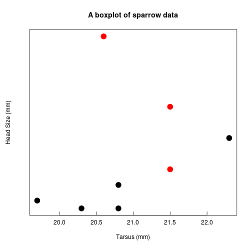
axis range or limits: xlim, ylim
R will try and make the axes look pretty. Sometimes this is not what you want. Use these two arguments to explicitly set the min and max of each axis.
Note xlim and ylim are not arguments of par(), they are arguments of anothor function that is called by plot(). As such, they are placed within the plot() command.
par(tcl = 0.5, mgp = c(2.5, 0.5, 0), las = 1)

plot(Head ~ Tarsus, data = BirdData,
     xlab = 'Tarsus (mm)',
     ylab = 'Head Size (mm)',
     main = 'A boxplot of sparrow data',
     pch = 20,
     col = Species,
     cex = 3,

ylim = c(29, 34)) 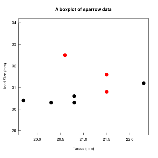
Fonts
Many journals require specific fonts.
Fonts in R (and other software) are tricky, because each graphics device (e.g., pdf, png, ...) has its own default fonts and system of dealing with fonts. Further, font can be specified in several different ways, and there is no universal system of naming or calling fonts in computer operating systems. See here for those who are interested.
However, there are some straightforward things we can do easily.
font style
You can use font = to specify whether the font is plain (1, default), bold (2), italic (3), or bold italic (4).
font.axis, font.lab, font.main, font.sub set fonts for each respective text.
font family
In many graphics devices, you can also specify the family (serif (often Times New Romas), san-serif (often Helvetica), monotype (often Courier)) via family = 'serif', family = 'sans', or family = 'mono'.
par(tcl = 0.5, mgp = c(2.5, 0.5, 0), las = 1,
    font.main = 4, font.lab = 3,        # set plot title to bold italic, and axis labels to italic
    family = 'serif')               # set font to the default serif font (often Times New Roman).

plot(Head ~ Tarsus, data = BirdData,
     xlab = 'Tarsus (mm)',
     ylab = 'Head Size (mm)',
     main = 'A plot of sparrow data',
     pch = 20,
     col = Species,
cex = 3) 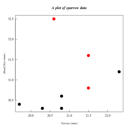
[EXTRA:] You can access the majority of other fonts on your computer with the extrafonts package. More details here.
Margins
As with mgp, margin size is specified in units of the number of lines of text.
setting the margins for individual plots: mar
You can specify the amount of white space on each side of the graph
par(mar = c(5, 4, 4, 2)) is the default, for sides clockwise from (bottom, left, top, right).
setting margins for the whole figure: oma
A vector of the form c(bottom, left, top, right) giving the size of the outer margins in lines of text. This is useful to use in multi-panel plot (see below) where you need to add text to one side or another.
Arranging multiple plots
So far we have just placed one plot or panel in each graphics window. However, in many cases you will want multiple similar plots side-by-side, or different kinds of plots in the same overall figure.
There are various ways to do this.
Note If you plot more figures than the number of panels available, they will start to overwrite from the beginning.
Regular grids or arrays of plot panels using par()
You can establish a grid of panels which are then filled by separate calls to plot() (or another graphics plotting function).
par() has two similar options, mfrow and mfcol. Both arguments take a vector of the form c(number of rows, number of columns). mfcol fills this grid by colums, mfrow fills by rows. e.g.:
par(mfrow = c(2, 2))creates a graphics window with four panels, in a 2 x 2 layout.par(mfcol = c(4, 1))creates a column of four panels.
Here, we plot Head as a function of the four other variables in the data.
par(mfcol = c(2,2),
    tcl = 0.5, mgp = c(2.5, 0.5, 0), las = 1
   )

plot(Head ~ Tarsus, data = BirdData,
     xlab = 'Tarsus (mm)',
     ylab = 'Head Size (mm)',
     main = 'Head vs Tarsus',
     pch = 20,
     col = Species,
     cex = 3)

plot(Head ~ Wingcrd, data = BirdData,
     xlab = 'Wingcrd (m)',
     ylab = 'Head Size (mm)',
     main = 'Head vs Wing',
     pch = 20,
     col = Species,
     cex = 3)

plot(Head ~ Weight, data = BirdData,
     xlab = 'Weight (kg)',
     ylab = 'Head Size (mm)',
     main = 'Head vs Weight',
     pch = 20,
     col = Species,
     cex = 3)

plot(Head ~ Species, data = BirdData,
     xlab = 'Species',
     ylab = 'Head Size (mm)',
     main = 'Head vs Species',
     pch = 20,
     col = 1:2,
cex = 3) 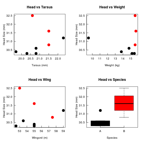
Irregular arrays of panels using layout()
layout() divides the plotting region/window up into as many rows and columns as there are in matrix mat, with the column-widths and the row-heights specified in the respective arguments
This can be useful for setting up regular arrays, but more often it is used if you want different kinds of graphics together in the same figure. For example, here, we plot the scatterplot of Head on Tarsus, but add a histogram of each to two sides.
# First, set up data for each histogram (we will cover this in more detail later)
# The plot = FALSE argument means that nothing is plotted,
# and the result is stored in the objects 'xhist' and 'yhist'
xhist <- hist(BirdData$Head, plot = FALSE)
yhist <- hist( BirdData$Tarsus, plot = FALSE)

# get maximum values
top <- max(c(xhist$counts, yhist$counts))

# set range of each data to match histograms to scatterplot axes
yrange <- c(30, 33)
xrange <- c(19.5, 22.5)

# use layout() to set up plotting region
nf <- layout(matrix(c(2,0,1,3),2,2,byrow = TRUE), c(3,1), c(1,3), TRUE)
layout.show(nf)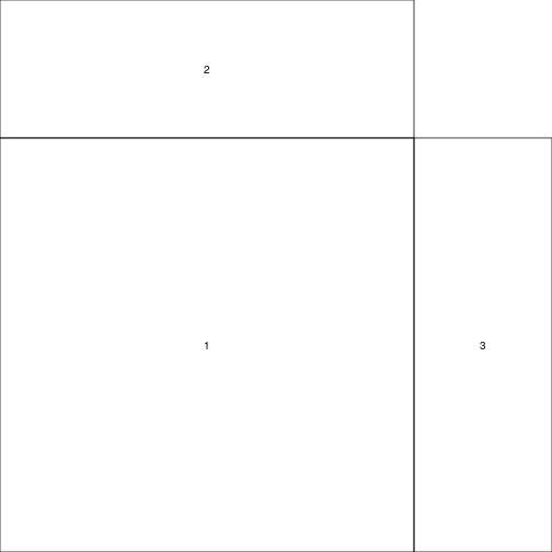
# plot each part of the figure, setting margins to match up each time.
par(mar = c(5,5,1,1))
plot(Head ~ Tarsus, data = BirdData, xlim = xrange, ylim = yrange, xlab = "Tarsus (mm)", ylab = "Head Size (mm)")

par(mar = c(0,5,1,1))
barplot(xhist$counts, axes = FALSE, ylim = c(0, top), space = 0)

par(mar = c(5,0,1,1))
barplot(yhist$counts, axes = FALSE, xlim = c(0, top), space = 0, horiz = TRUE)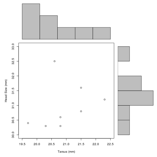
In this example, we use matrix() to set up the order of plotting.
This command
matrix(c(2,0,1,3), nrow = 2, ncol = 2, byrow = TRUE)## [,1] [,2]
## [1,] 2 0
## [2,] 1 3sets up a 2 x 2 matrix, where the first plot goes in the bottom left (1), second in top left (2), third in bottom right (3), with nothing in the top right (0). The plan can be seen following the layout.show() command above.
Note that layout() is incompatible with par(mfrow, mfcol).
Other graphics systems in R
There are two other main graphics systems in R, both loaded via separate packages.
lattice
The lattice package makes some improvements on base R graphics with better defaults and the ease of displaying multivariate relationships. The package also enables the display of variable/s conditioned on one or more other variables.
The use of par() does not affect most uses of lattice graphics.
More details can be found here and links therein.
ggplot2
The ggplot2 package attempts to realise the fundamental connections and structure between data and graphics developed by Leland Wilkinson.
The use of par() does not affect most uses of ggplot2 graphics.
As with base R and lattice, the defaults need some modification for publishing in manuscripts.
More details can be found here and at the package site
Building a plot
Up to now, we have merely changed the appearance of existing features of default plots. However, each element of a plot can be suppressed or created independently. We will now recreate our simple plot.
First, we make an empty plotting window
plot(Head ~ Tarsus, data = BirdData,
     type = 'n',            # plot type, no plotting
     xlab = '', ylab = '',      # blank axis labels
     axes = FALSE           # no axes (or xaxt = 'n', yaxt = 'n')
     )
add lines: lines()
Line type (solid, dashed, etc.) can be altered with the lty = argument.
Line width can be altered with lwd =.
plot(Head ~ Tarsus, data = BirdData,
     type = 'n',            # plot type, no plotting
     xlab = '', ylab = '',      # blank axis labels
     axes = FALSE           # no axes (or xaxt = 'n', yaxt = 'n')
     )

lines(x = BirdData$Tarsus, y = BirdData$Head, col = 'grey', lty = 3, lwd = 2)
add data points: points()
As with the call to plot(), you can specify the plotting character pch, size cex, colour col, etc.
plot(Head ~ Tarsus, data = BirdData,
     type = 'n',            # plot type, no plotting
     xlab = '', ylab = '',      # blank axis labels
     axes = FALSE           # no axes (or xaxt = 'n', yaxt = 'n')
     )

lines(x = BirdData$Tarsus, y = BirdData$Head, col = 'grey', lty = 3, lwd = 2)

points(x = BirdData$Tarsus, y = BirdData$Head, col = BirdData$Species, pch = 20, cex = 3)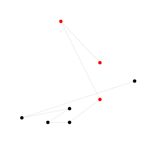
add axes: axis()
Here, you have to specify which side of the plot and where you want the tick marks and their labels.
plot(Head ~ Tarsus, data = BirdData,
     type = 'n',            # plot type, no plotting
     xlab = '', ylab = '',      # blank axis labels
     axes = FALSE           # no axes (or xaxt = 'n', yaxt = 'n')
     )

lines(x = BirdData$Tarsus, y = BirdData$Head, col = 'grey', lty = 3, lwd = 2)

points(x = BirdData$Tarsus, y = BirdData$Head, col = BirdData$Species, pch = 20, cex = 3)

axis(side = 1, at = c(20, 20.5, 21, 21.5, 22), labels = c(20, 20.5, 21, 21.5, 22))
axis(side = 2, at = seq(from = 30.5, to = 32.5, by = 0.5))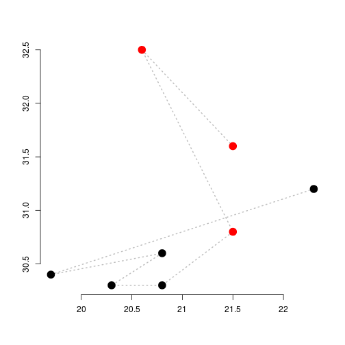
a box around the plotting area: box()
Line type, etc. can also be specified here.
plot(Head ~ Tarsus, data = BirdData,
     type = 'n',            # plot type, no plotting
     xlab = '', ylab = '',      # blank axis labels
     axes = FALSE           # no axes (or xaxt = 'n', yaxt = 'n')
     )

lines(x = BirdData$Tarsus, y = BirdData$Head, col = 'grey', lty = 3, lwd = 2)

points(x = BirdData$Tarsus, y = BirdData$Head, col = BirdData$Species, pch = 20, cex = 3)

axis(side = 1, at = c(20, 20.5, 21, 21.5, 22), labels = c(20, 20.5, 21, 21.5, 22))
axis(side = 2, at = seq(from = 30.5, to = 32.5, by = 0.5))

box()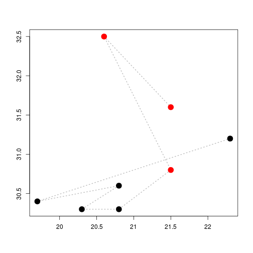
add axis labels to margins: mtext(),
plot(Head ~ Tarsus, data = BirdData,
     type = 'n',            # plot type, no plotting
     xlab = '', ylab = '',      # blank axis labels
     axes = FALSE           # no axes (or xaxt = 'n', yaxt = 'n')
     )

lines(x = BirdData$Tarsus, y = BirdData$Head, col = 'grey', lty = 3, lwd = 2)

points(x = BirdData$Tarsus, y = BirdData$Head, col = BirdData$Species, pch = 20, cex = 3)

axis(side = 1, at = c(20, 20.5, 21, 21.5, 22), labels = c(20, 20.5, 21, 21.5, 22))
axis(side = 2, at = seq(from = 30.5, to = 32.5, by = 0.5))

box()

mtext(side = 1, line = 3, text = 'Tarsus (mm)', font = 2)
mtext(side = 2, line = 3, text = 'Head (mm)', font = 4)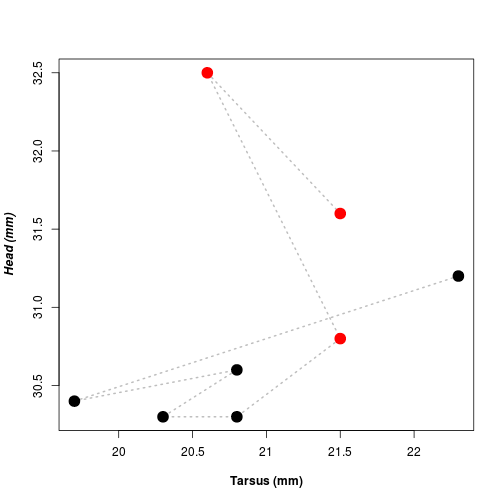
add a straight line: abline()
Again, you can change the line type and width.
plot(Head ~ Tarsus, data = BirdData,
     type = 'n',            # plot type, no plotting
     xlab = '', ylab = '',      # blank axis labels
     axes = FALSE           # no axes (or xaxt = 'n', yaxt = 'n')
     )

lines(x = BirdData$Tarsus, y = BirdData$Head, col = 'grey', lty = 3, lwd = 2)

points(x = BirdData$Tarsus, y = BirdData$Head, col = BirdData$Species, pch = 20, cex = 3)

axis(side = 1, at = c(20, 20.5, 21, 21.5, 22), labels = c(20, 20.5, 21, 21.5, 22))
axis(side = 2, at = seq(from = 30.5, to = 32.5, by = 0.5))

box()

mtext(side = 1, line = 3, text = 'Tarsus (mm)', font = 2)
mtext(side = 2, line = 3, text = 'Head (mm)', font = 4)

abline(h = 31, lty = 2, lwd = 3)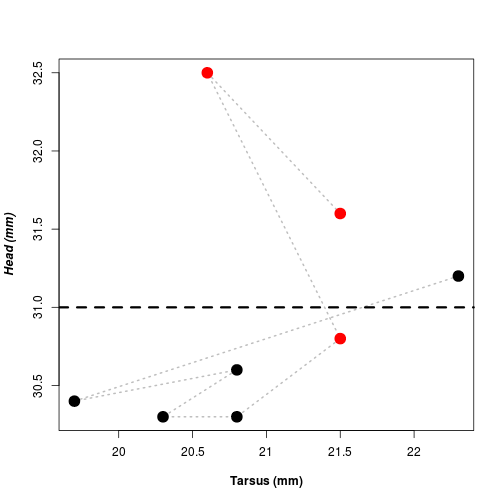
add text: text()
Similarly to points(), text can be plotted in any location. Use adj or pos to specify the text in relation to the coordinates.
plot(Head ~ Tarsus, data = BirdData,
     type = 'n',            # plot type, no plotting
     xlab = '', ylab = '',      # blank axis labels
     axes = FALSE           # no axes (or xaxt = 'n', yaxt = 'n')
     )

lines(x = BirdData$Tarsus, y = BirdData$Head, col = 'grey', lty = 3, lwd = 2)

points(x = BirdData$Tarsus, y = BirdData$Head, col = BirdData$Species, pch = 20, cex = 3)

axis(side = 1, at = c(20, 20.5, 21, 21.5, 22), labels = c(20, 20.5, 21, 21.5, 22))
axis(side = 2, at = seq(from = 30.5, to = 32.5, by = 0.5))

box()

mtext(side = 1, line = 3, text = 'Tarsus (mm)', font = 2)
mtext(side = 2, line = 3, text = 'Head (mm)', font = 4)

abline(h = 31, lty = 2, lwd = 3)

text(x = 20.58, y = 32.5, labels = 'This bird is actually a seagull', pos = 4)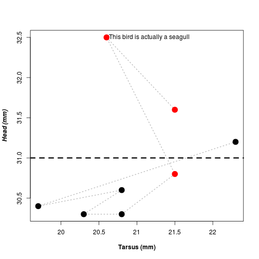
Exporting graphics
Graphics systems in computers
Computers use two different graphical systems to create images.
- vector graphics use points, lines, curves and polygons, thus images are infinitely scalable, e.g. pdf, svg, eps.
- Type: graphs, diagrams.
- Use: Most journals.
- Recommended: .pdf
- raster graphics or bitmaps use a rectangular grid of pixels, e.g. bmp, png, jpg.
- Type: photos, images, maps.
- Use: graphs in websites, embedded figures in word processors, photos in manuscripts.
- Recommended: .png
Graphics in R can be saved as any of these formats. Most journals require graphs to be saved in a vector format such as .pdf. This kind of graphic is scalable, ie you can zoom in and it will still look crisp.
How to export graphics from R
There are various options depending on your operating system and way of working with R.
1. RStudio
OS: all
Within the 'plot' sub-window, click 'Export' to select how to save the plot.
2. graphics functions: pdf(), png(), tiff(), jpeg(), ...
OS: all
Once you have the figure looking as you like it, the best way to produce publication-quality figures is to use a specific graphics device function. For graphs, the best format is usually pdf().
Specify the file name and its size. The pdf is sized in inches (7 x 7); png and jpg in pixels (480 x 480). Once you have run all the plotting you want, close the graphics device with dev.off(). The file with then appear in your folder.
pdf("filename.pdf", height = 7, width = 7, ... )

plot( ... )

dev.off()
3. copy and paste
OS: windows, (mac?)
To import a graph from R into a word processor such as Microsoft Word, right-click on the graph in R, and copy and paste as normal.
4. save from the graphics window
OS: windows, (mac?)
From the open graphics windown, right-click as above, and save as a Windows metafile, bitmap or postscript file.
Importing graphics to manuscripts and presentations
Many word processing packages struggle with importing pdf files, and so png files are easier to work with.
If you do your writing in Markdown or LaTeX (which we can cover later), pdf are easy to work with.
Exercises
Using the New Haven Road Race data...
dat <- read.table('http://www.simonqueenborough.info/R/data/race-data-full.txt', header = TRUE, sep  = '\t')
dat <- na.omit(dat)
dat2 <- droplevels(dat)- Plot Net time as a function of Place.
- Modify the y-axis to start at 0 and go to 120.
- Modify both axes to flip the tick marks to point inwards. Shift the axis labels and numbers in also.
- Add points for Pace as a function of Place.
# Modify both axes to flip the tick marks to point inwards. Shift the axis labels and numbers in also
par(tcl = 0.5, mgp = c(2.5, 0.5, 0))
# Plot Net time as a function of Place
plot(Nettime_mins ~ Place, data = dat2,
# Modify the y-axis to start at 0 and go to 120.
ylim = c(0, 120))
# Add points for Pace as a function of Place
points(Pace_mins ~ Place, data = dat2, pch = 20, col = 'red')
- Within a 1 row x 3 column array, plot the following: Pace versus place, Net time versus sex, Pace versus age class
- Make everything twice as large.
- Increase the line width.
- Decrease the top and right margin of each panel.
Quiz 4
Using the sparrow data set.
dat <- read.table(file = "http://www.simonqueenborough.info/R/data/sparrows.txt", header = TRUE)1. Create a plot with 4 panels (2 x 2).
The panels should show the following barplots:
- top left, the number of males and females of species SESP
- top right, the number of males and females of species SSTS
- bottom left, the number of individuals in each species that are male
- bottom right, the number of individuals in each species that are female
To help aid comparisons, make sure that the y axes for the two plots in each row have the same range.
Each panel should have x and y axis labels in bold.
2. For species SSTS, make a three-panel horizontal figure.
Plot Tarsus, Head, and Weight each as a function of Sex in separate panels.
Ensure that males and females are different colours.
Each panel should have the lines wider than the default width and horizontal y-axis numbers.
3. Make a five-panel plot.
Plot Wingcrd as a function of Tarsus, Head, Culmen, Weight, and Nalospi, differentiating each species by colour and/or symbol.
Ensure that the tick marks point inwards and the axis labels have units (you can make up what the units are).
Updated: 2016-10-04