FES 720 Introduction to R
Using Colour
autosize: true
FES 720: Intro to R

=======
“avoiding catastrophe becomes the first principle in bringing color to information: Above all, do no harm.”
Envisioning Information, Edward Tufte, Graphics Press, 1990
=======
Using Colour
-
Physics of colour
-
Practicalities of colour
-
Accessibiilty of colour
=======
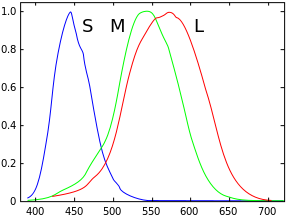
1. Physics of Colour
Colour is ‘visible light’
=======
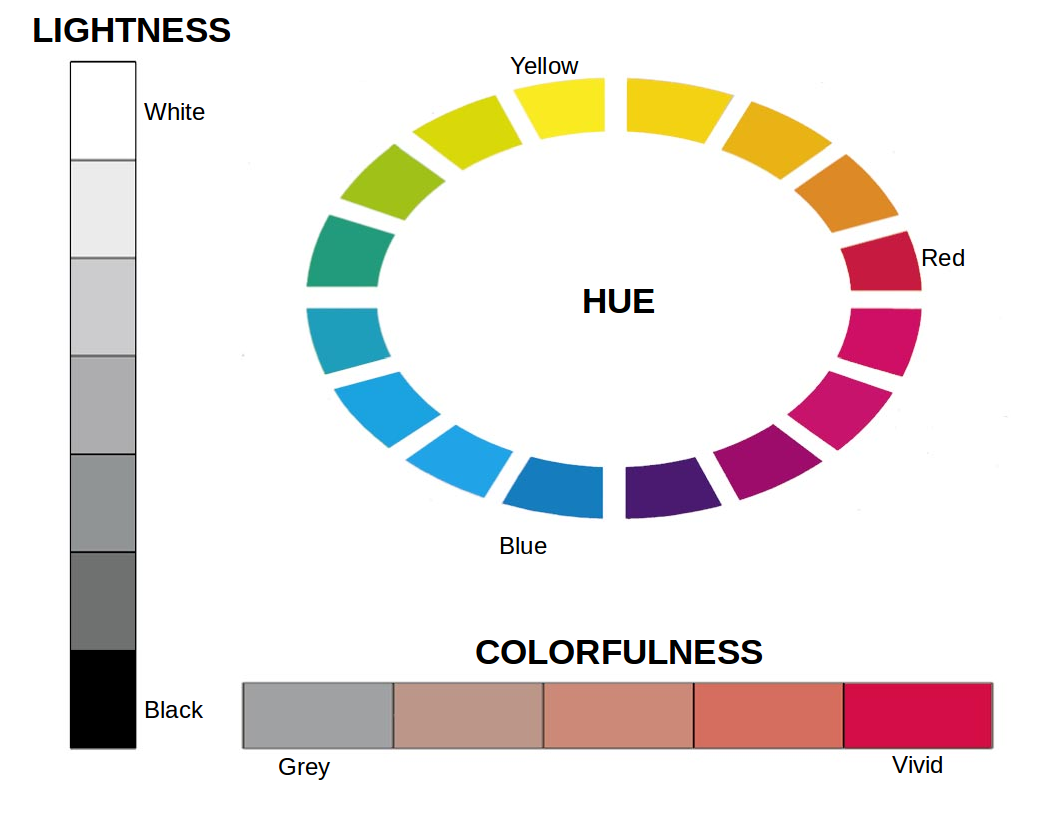
Describing colour
1. Hue, lightness, and colorfulness
=======
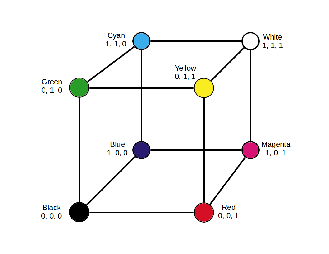
Describing colour
2. RGB
=======
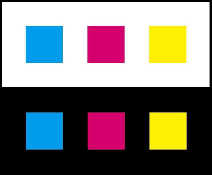
Background matters
Colors look darker and smaller against white and lighter and larger against black.
=======
Use a consistent background colour
-
Avoid gradients of colour
-
Avoid any other variation in background colour
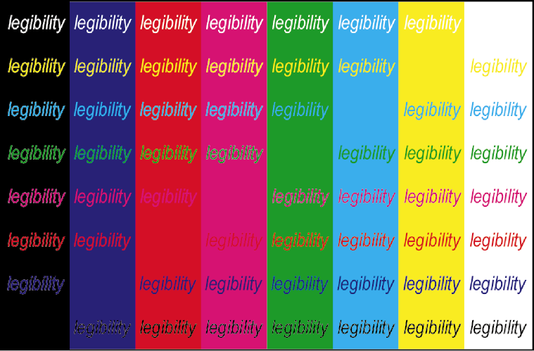
Simultaneous contrast can make the same colors look different

Simultaneous contrast can make different colors look the same

=======
Ensure background contrasts with text and data colours
-
Light (e.g., white) and low colourfulness colours (pale greys, creams, etc).
-
If using colours to highlight text (e.g., heatmaps) ensure enough contrast.
=======
2. Practicalities of Colour
Use color to communicate information
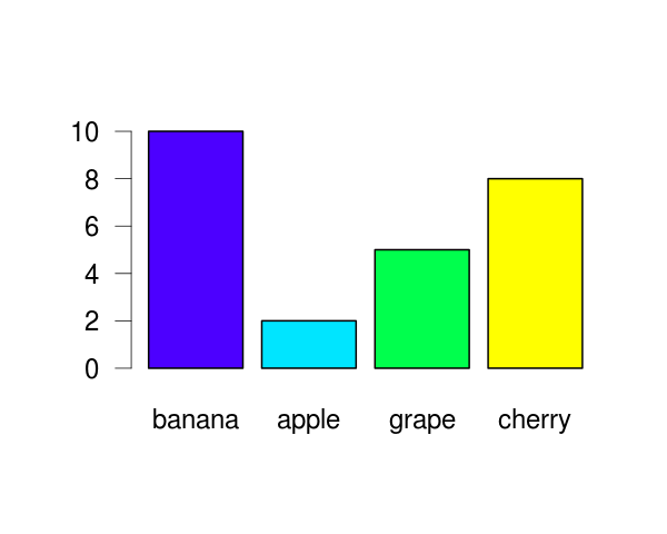
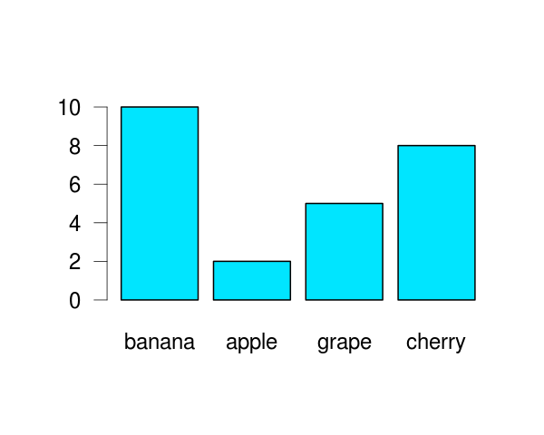
Colour !- decoration / wallpaper.
=======
Different colors should correspond to different meanings
=======
Three main uses of colour to promote communication
• To highlight particular data
• To group items (categories)
• To encode quantitative values (sequential or diverging)
=======
Use soft, natural colors to display most information and bright and/or dark colors to highlight information
=======
Use colours of the same hue to group/categorise data
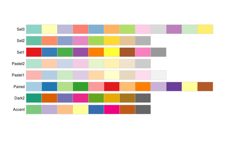
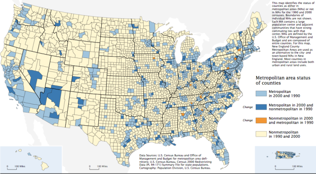
Fig A example categorical map from the US census of 2000.
=======
Use colours of increasing/decreasing brightness or colorfulness to illustrate quantitative data
Sequential
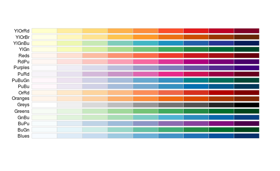
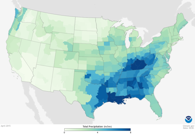
Fig. A map of precipitation with a sequential lightness-hue ramp from climate.gov.
=======
Use colours of increasing/decreasing brightness or colorfulness to illustrate quantitative data
Diverging
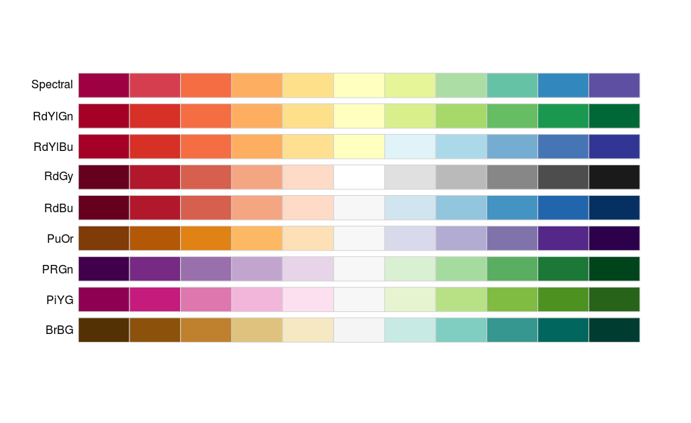
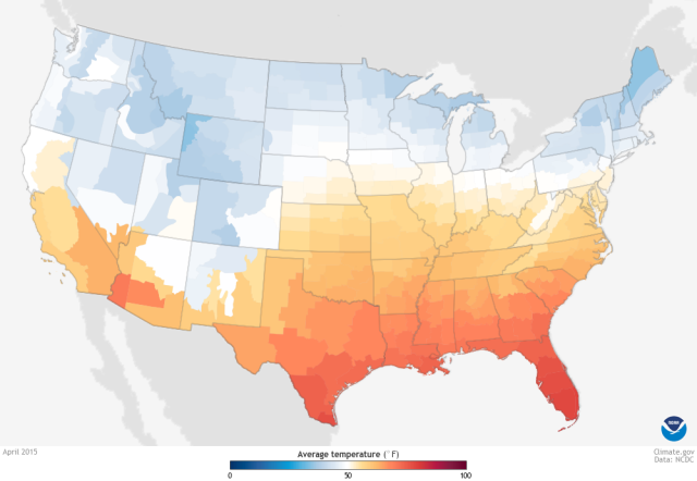
Fig A map of temperature anomaly form climate.gov.
=======
Use light colours for non-data components
| Component | Default Color |
|---|---|
| Axis lines | Thin gray lines of medium intensity. |
| Borders | If needed, thin gray lines of medium intensity. |
| Background | Use white or ‘None’ |
=======
Some suggestions for data components of graphs
-
Use distincts hue of medium intensity for each data series.
-
For small data points or thin lines, use distinct hue of high intensity.
-
For larger data points or wider lines, use distinct hues of medium intensity.
=======
3. Accessibility of Colour
Red-green colourblindness affects:
-
about 8% of the male population and
-
0.5% of the female population
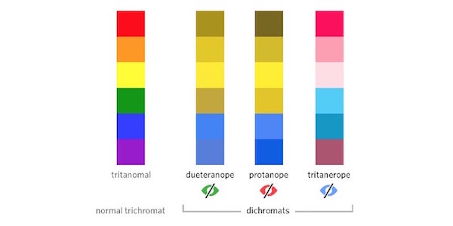
Use colour and symbols
Keep colours minimal
Avoid problem colour combinations
See: http://blog.usabilla.com/how-to-design-for-color-blindness/
=======
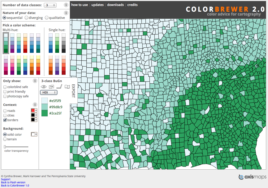
Use colorbrewer to help with everything!
=======
References
Few, S. 2008. Practical Rules for Using Color in Charts
MacDonald, L.W. 1999. Using Color Effectively in Computer Graphics
https://betterfigures.org/2015/06/23/picking-a-colour-scale-for-scientific-graphics/